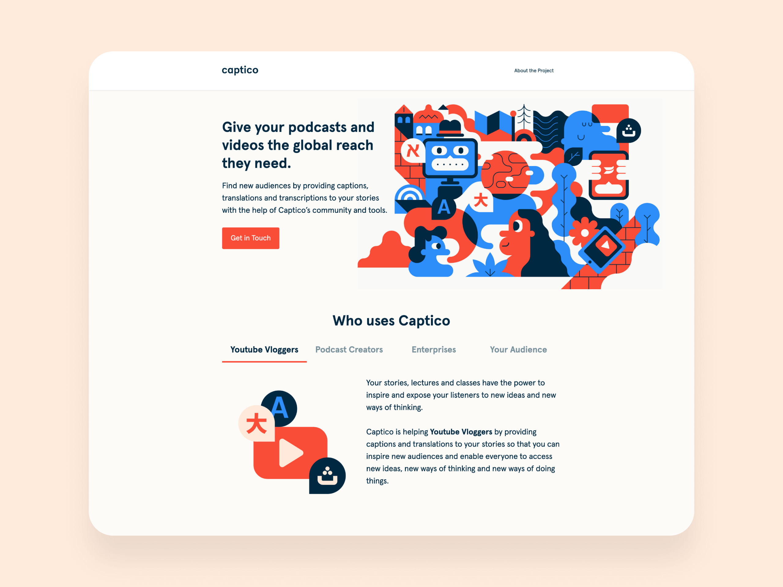
Captico connects creators with translators to expand the reach of their Youtube videos and enable their unique content to reach new audiences through localisation.

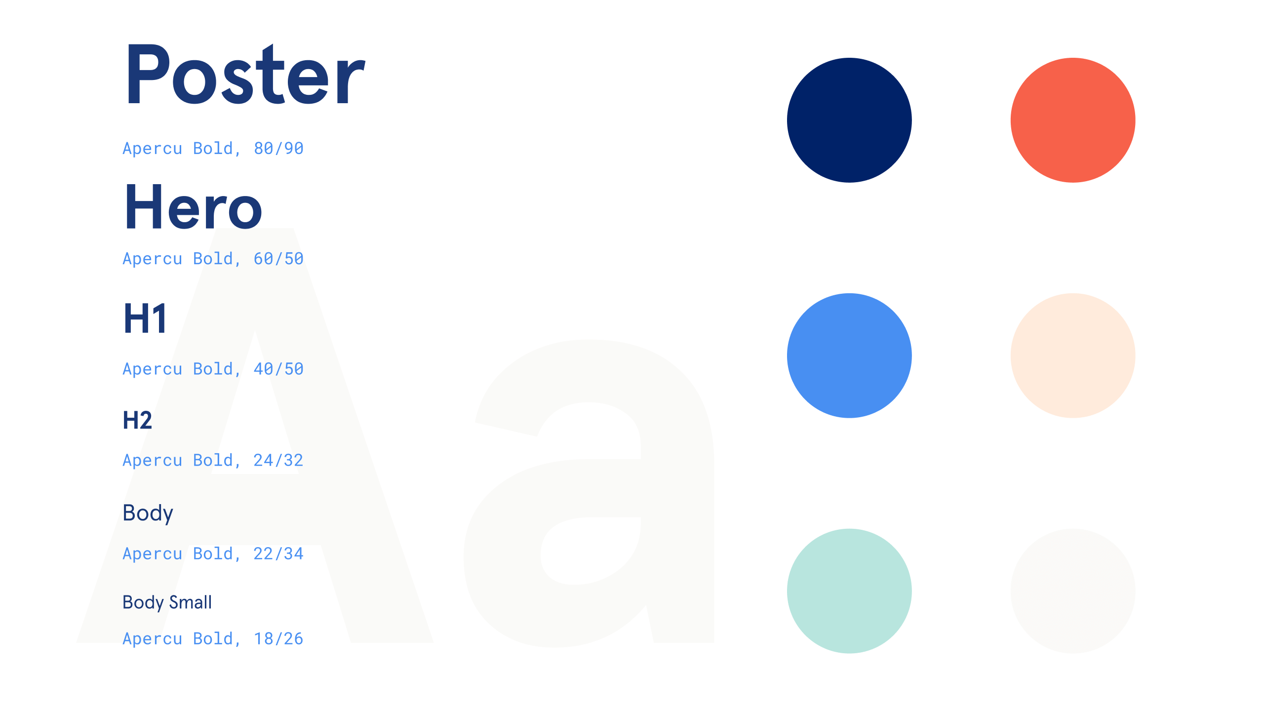
A brand, along with company name and landing page was created to promote Captico and help YouTubers across the globe.

User interface (UI) and illustrations for Captico landing page and podcast pages.

Captico’s objective is to enable brilliant content to be spread across the globe. YouTube has incredible teachers and storytellers that can only reach their local audiencies: language is the limiting factor.

This is a self-started service to streamline content translation allowing users of all ages to reach these resources without being limited to their language or country.

Illustration representing the diversity of ideas that can be unlocked when language barriers disappear. It shows a collection of characters talking in different languages around a globe.
User interface (UI) for Captico's landing page.

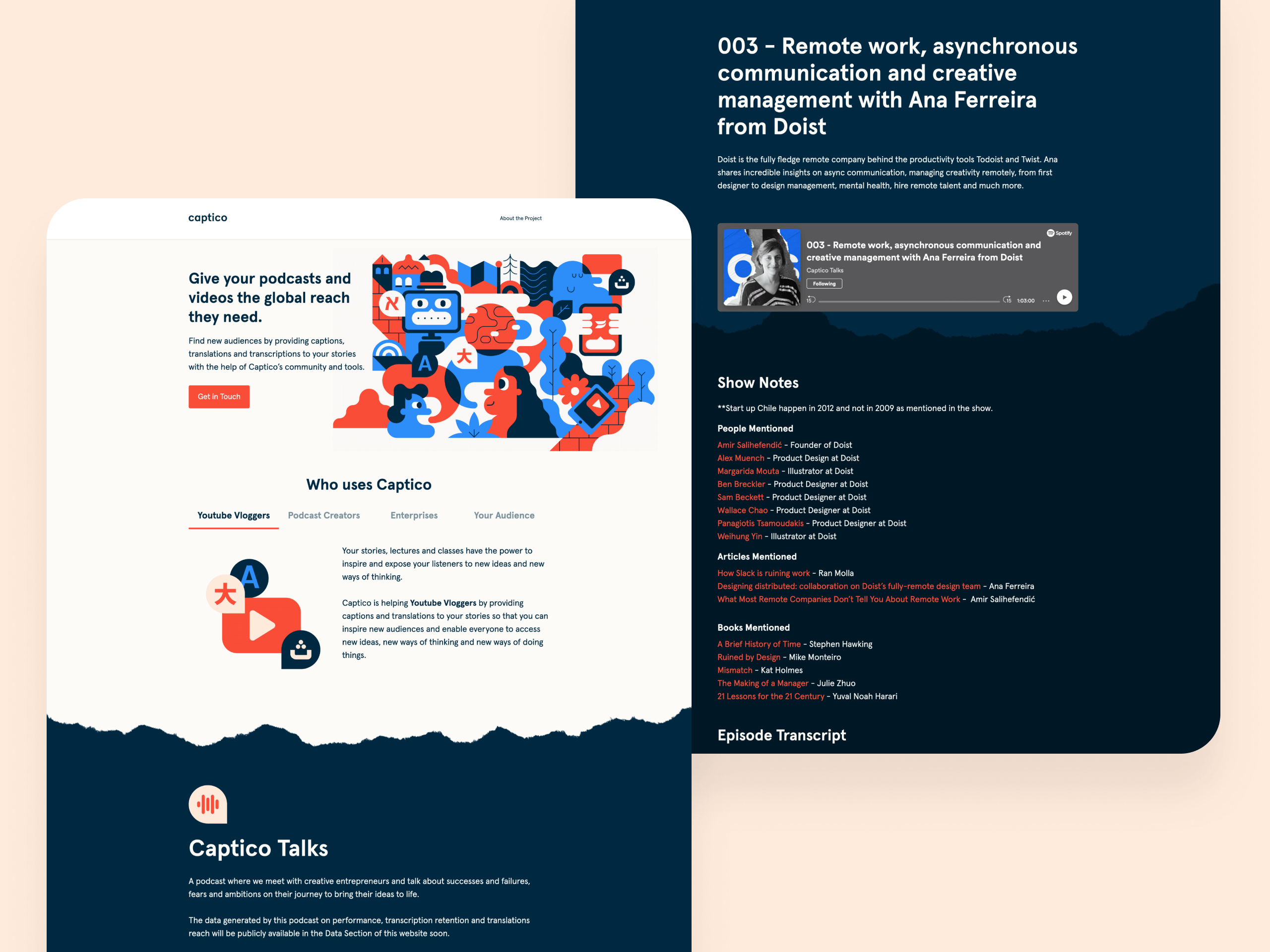
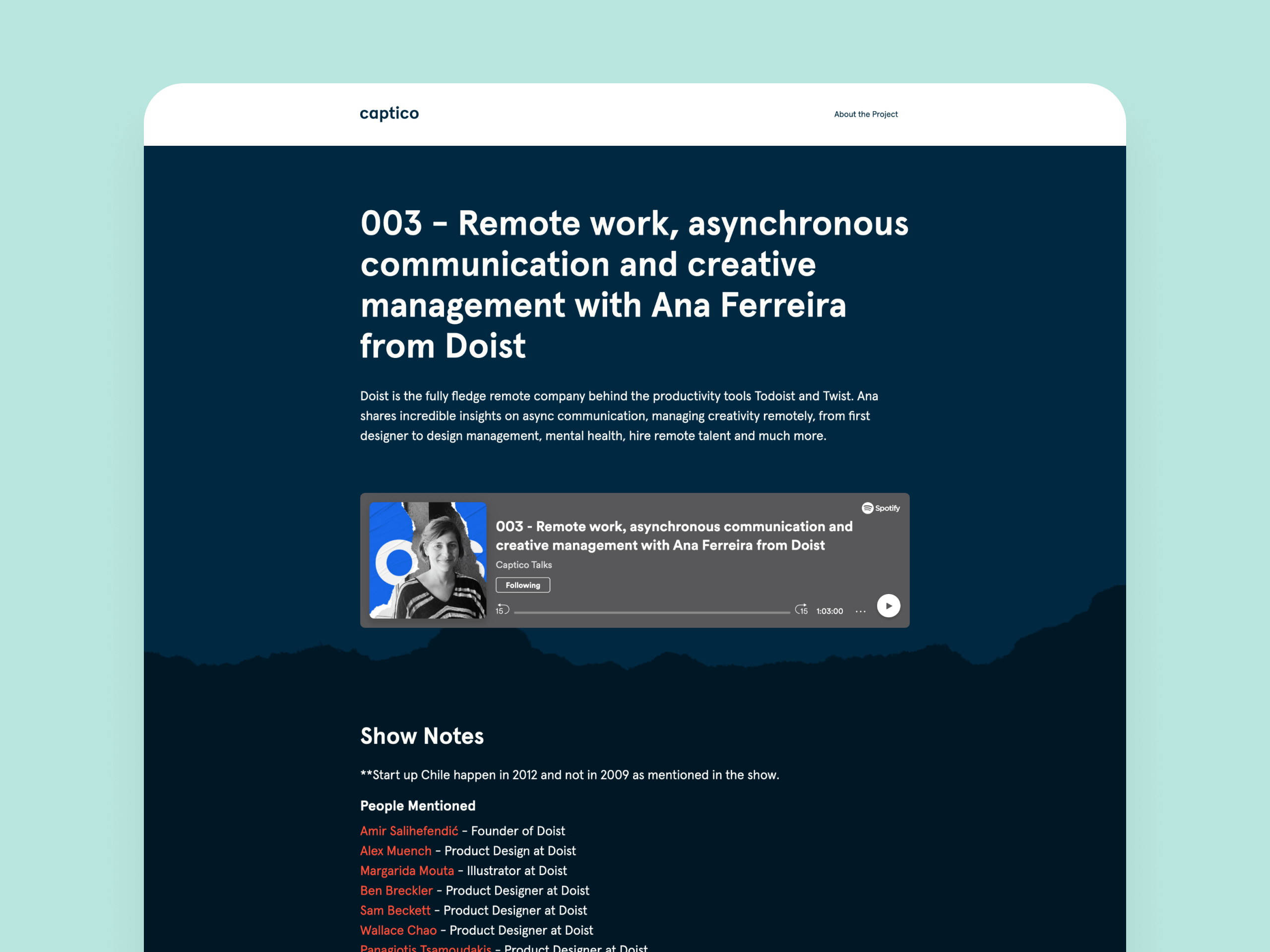
The case for a podcast.

To help people understand Captico’s value, I created a podcast that would be the platform to trial the service.

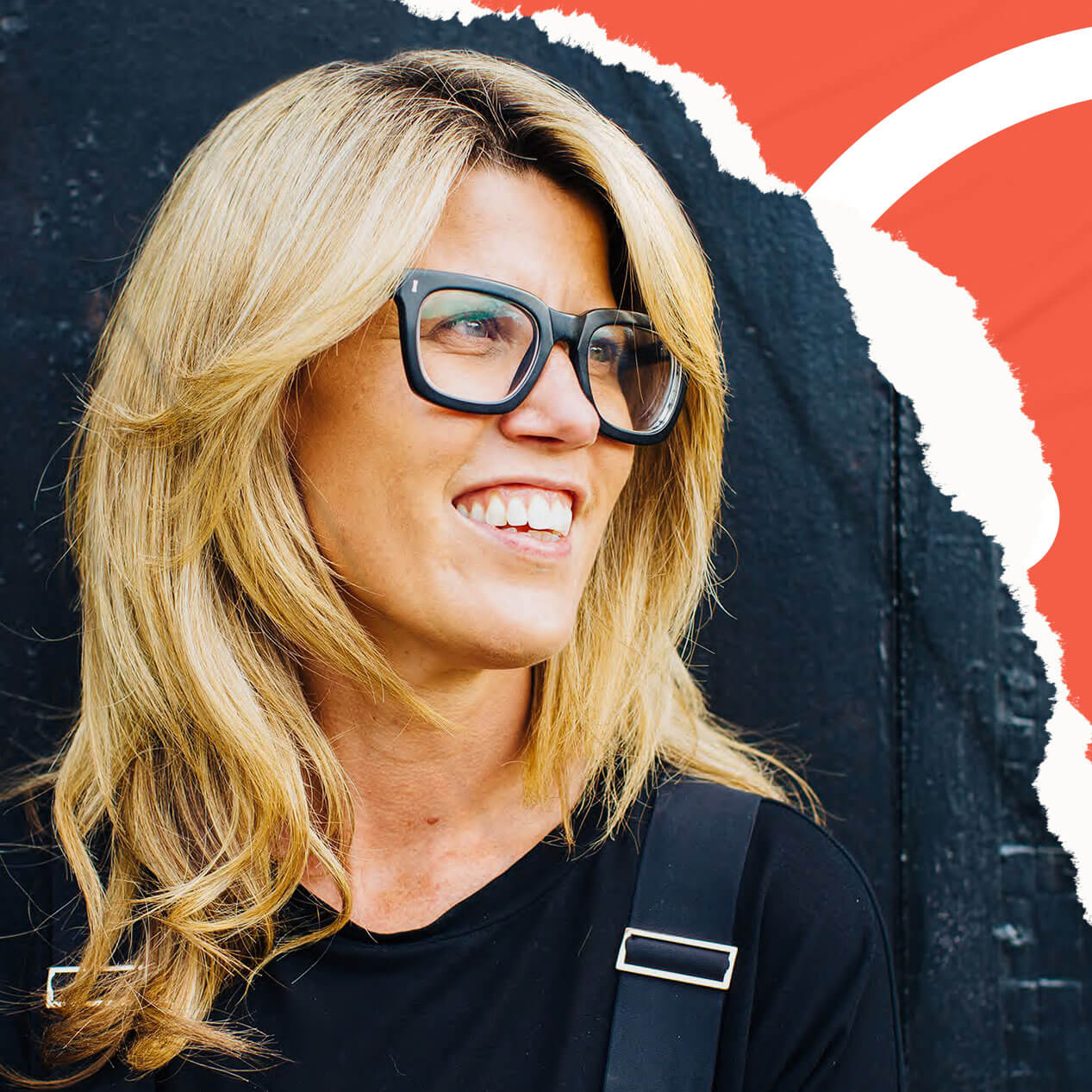
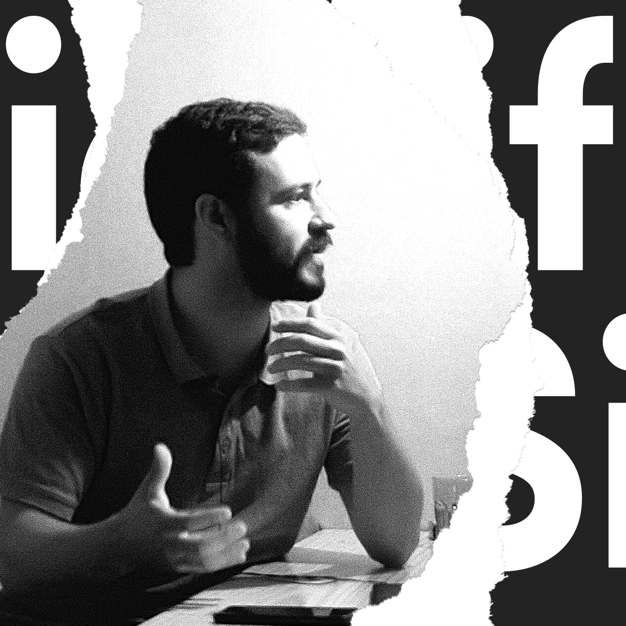
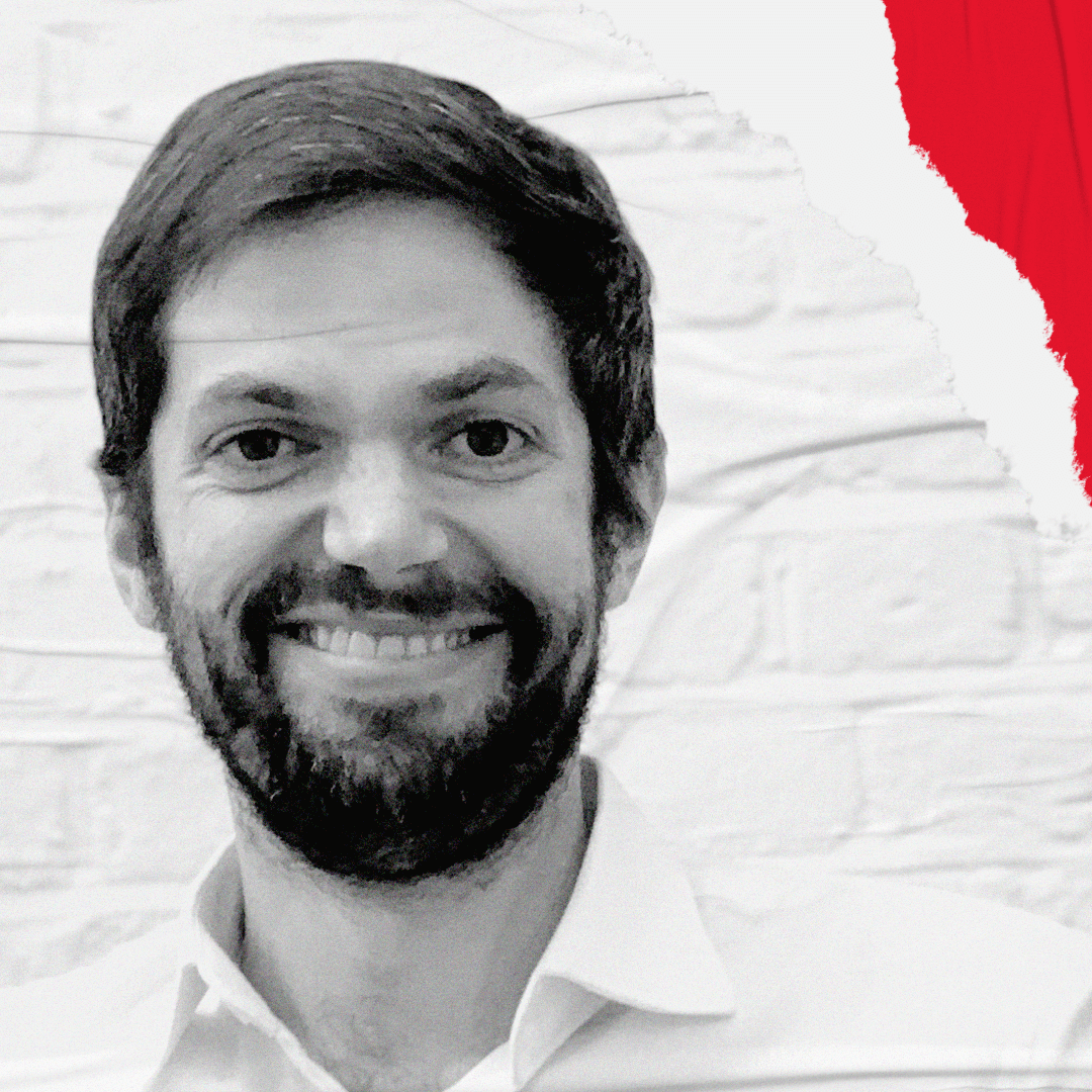
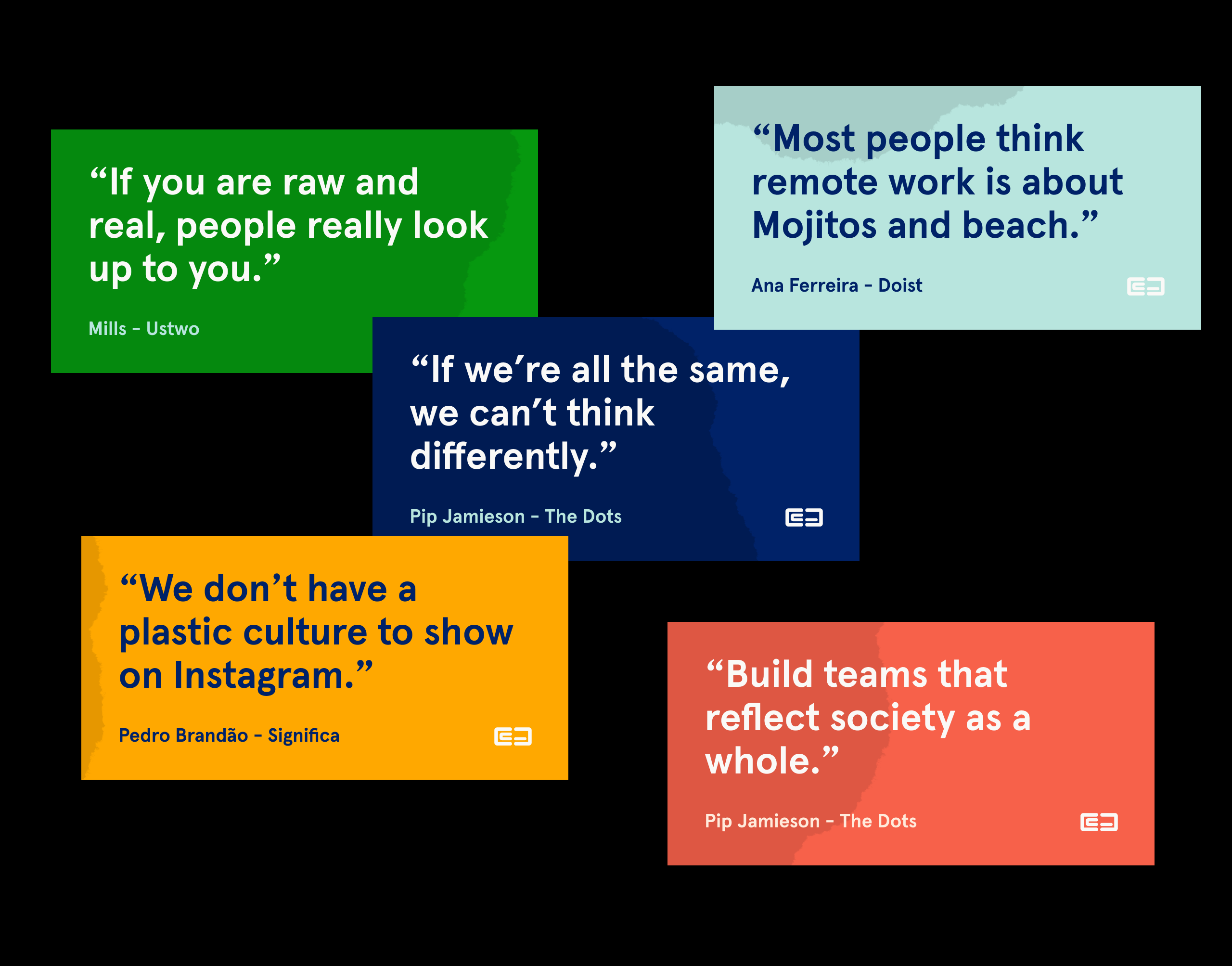
We conducted interviews with a handful of creative leaders, ranging from the Founder of Ustwo, the Product Manager at Doist and the founder of The Dots Network. With the results of these and through creative direction and branding, I built awareness of the service and its capabilities.

Captico's podcast cover art.
User interface (UI) for Captico's podcast webpage displaying Ana Ferreira episode details.
Picture of Pip Jamieson, founder of The-Dots Network.
Picture of Pedro Brandão, founder of Significa.
Picture of Ana Ferreira, Product Manager at Doist.
Picture of Matt Brooke-Smith, founder of Future Workshops.
Collection of quotes from the interviews at Captico Talks.

Constant evolution

Recently the podcast changed its name to Shaping Chaos to focus exclusively on creativity and empowering organizations.

It is now part of the Thereforth family and I keep using Captico to spread the stories to a global audience.

Brand

  • Naming
  • Identity

Design

  • Visual Design
  • Illustration

Dokspot enables medical device manufacturers to provide electronic instructions for use (eIFU) for their products and improve the way instructions are handled, updated and delivered.

We helped Dokspot become a modern service provider by improving the overall platform experience to allow them to become a leader in health care solutions.

Woman working on a denture screw paired with Dokspot user interface for mobile and desktop.

As Dokspot started to scale, the overall platform experience started to deteriorate, making it harder to show prospective customers the platform’s value and retain their current customer base.

The brief was simple – to improve the overall user experience and allow customers to benefit from using the digital platform over paperwork.

After months of collaboration and thoughtful implementation of content strategy, user research, UX and UI, we built a robust experience that helps Dokspot make digital instructions available for any medical manufacturer that endeavours to become more efficient and resourceful.

“Today, we are more confident in presenting and talking about our product.”

CYRILLE DERCHÉ – Founder & CTO at Dokspot

Dokspot's product lines user interface (UI) with 7 products available.
Dokspot's activity dashboard with pending tasks over a colored background.

Accessibility by design

There are many touchpoints in device manufacturing. The process requires careful design and implementation that need to comply with a variety of global standards. Instruction writers and device manufactures have to work together to ensure there are no mistakes when an instruction goes live.

Initial research has shown that Dokspot’s validation process was convoluted and users were struggling to find the right action they needed to perform.

We implemented a modern and easily scannable experience that unified the platform and allowed Dokspot users to know what to do, at the right time.

Dokspot's server-side user interface (UI) showing a product line and it's multiple products and documents.
User experience (UX) diagram of Dokspot's server-side platform.
User interface (UI) of a product line with the search field highlighted.

A scalable system

Dokspot server side connects and builds the client interface. They were designed to have a consistent design language so users have a uniformed experience across the platform. We developed a library of components that can be used across multiple touchpoints enabling Dokspot to scale their services without compromising quality. This system had to comply with the specific white-label solutions unique to Dokspot’s strategy.

Dokspot's white label interface (UI) solution for product details as shown on desktop and mobile.
Mobile white label example of Dokspot's plaform using Galderma's branding with descriptions in English.
User experience (UX) diagram explaining the steps a user goes through when using Dokspot's platform.
Desktop white label example of Dokspot's plaform using Ico Tec's branding with descriptions in Portuguese.
Mobile white label example of Dokspot's plaform using Geistlich's branding with descriptions in English.
A collection of components that are used to create Dokspot's platform user interface (UI).
Female doctor using Dokspot's platform on her iPad reading instructions for use of a Galderma product.

Shared Ambition

Thereforth empowered Dokspot to move to the next stage of growth and become more confident in demoing the product to prospective clients. Bringing the value of design to industries with poor user experience, like device manufacturing is allowing Dokspot customers to stand out in the market.

Strategy

  • Product Strategy
  • Metric & Analytics
  • UX/UI Audit
  • Information Architecture (iA)
  • User Research

Design

  • User Experience Design (UX)
  • User Interface Design (UI)

Breezie operating system (OS) makes the Internet easy for senior citizens to connect with friends and family through multitude apps and instructions.

Working with Breezie, we developed an intuitive user experience that enabled the OS to scale and deliver a wider range of content to seniors around the world.

Intuitive user interface (UI) of Breezie starts screen showing 4 shortcuts.

Teaching through usage.

Breezie had a clear problem: educate seniors to use technology they have never encountered before

By conducting user research to understand how seniors interact with their family digitally, we built an intuitive and accessible user interface based on simple interactions making it less intimidating for them to try.

Partnering with Samsung enabled Breezie to operate at system level, improving the technology to enable its users to learn through experience, with the aid of their family.

User interface (UI) components that can be found on Breezie's design library. User interface (UI) components that can be found on Breezie's design library.
Hand pointing at user experience (UX) wireframes of Breezie's features.

Making it obvious.

Swipe, tap and scroll are all familiar and comfortable concepts from years of using technology.

We made these interactions obvious using clear information architecture and intuitive interface design. By highlighting different actions on the screen with visual and sound cues, we enabled seniors to understand at a glance what they could do.

Intuitive user interface (UI) showing a collection of contacts with big images and accessible buttons.
Intuitive user interface (UI) of Breezie contact page with 6 big buttons and a prominent picture to enable senior user understand content at glance.

Make the internet easy

Breezie’s mission to “make the Internet easy” was our North Star and was used to create an operating system that helps seniors connect with their relatives anywhere in the world

Strategy

  • Product Strategy
  • Metrics & Analytics
  • Information Architecture (iA)
  • User Research
  • User Testing

Design

  • User Experience Design (UX)
  • User Interface Design (UI)
  • Design System